Make Misleading Charts Like the Pros
For education and research only — learn the classic trickery and how to spot it, without losing your sense of humor.
Chart Builder
Explore misleading techniques, edit the data JSON, and compare with the proper version.
Reference Examples & Reading
Curated visuals with source URLs as supplemental info.

Although likely a mistake, the GPT-5 vs OpenAI O3 chart shown in the OpenAI GPT5 stream was a good example of how charts can be more misleading than the data itself.
https://x.com/EgeErdil2/status/1953505551570415718
Start Y well above zero to exaggerate small differences between bars or lines.
https://www.lrs.org/2020/06/10/visualizing-data-manipulating-the-y-axis/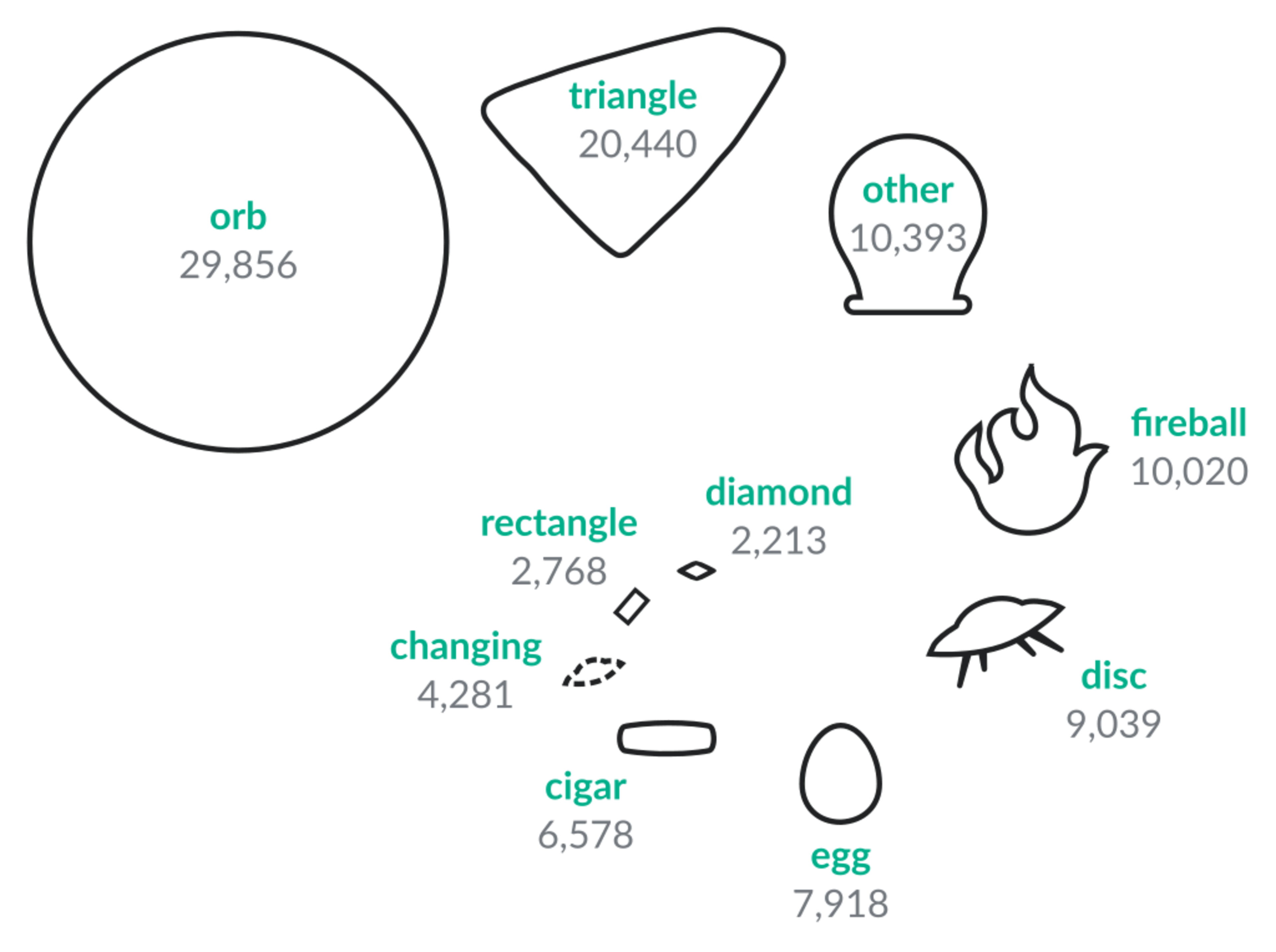
Decorative pictograms can add noise and bias perception compared to simple encodings.
https://commons.wikimedia.org/wiki/File:UFO_Sightings_by_Shape.svg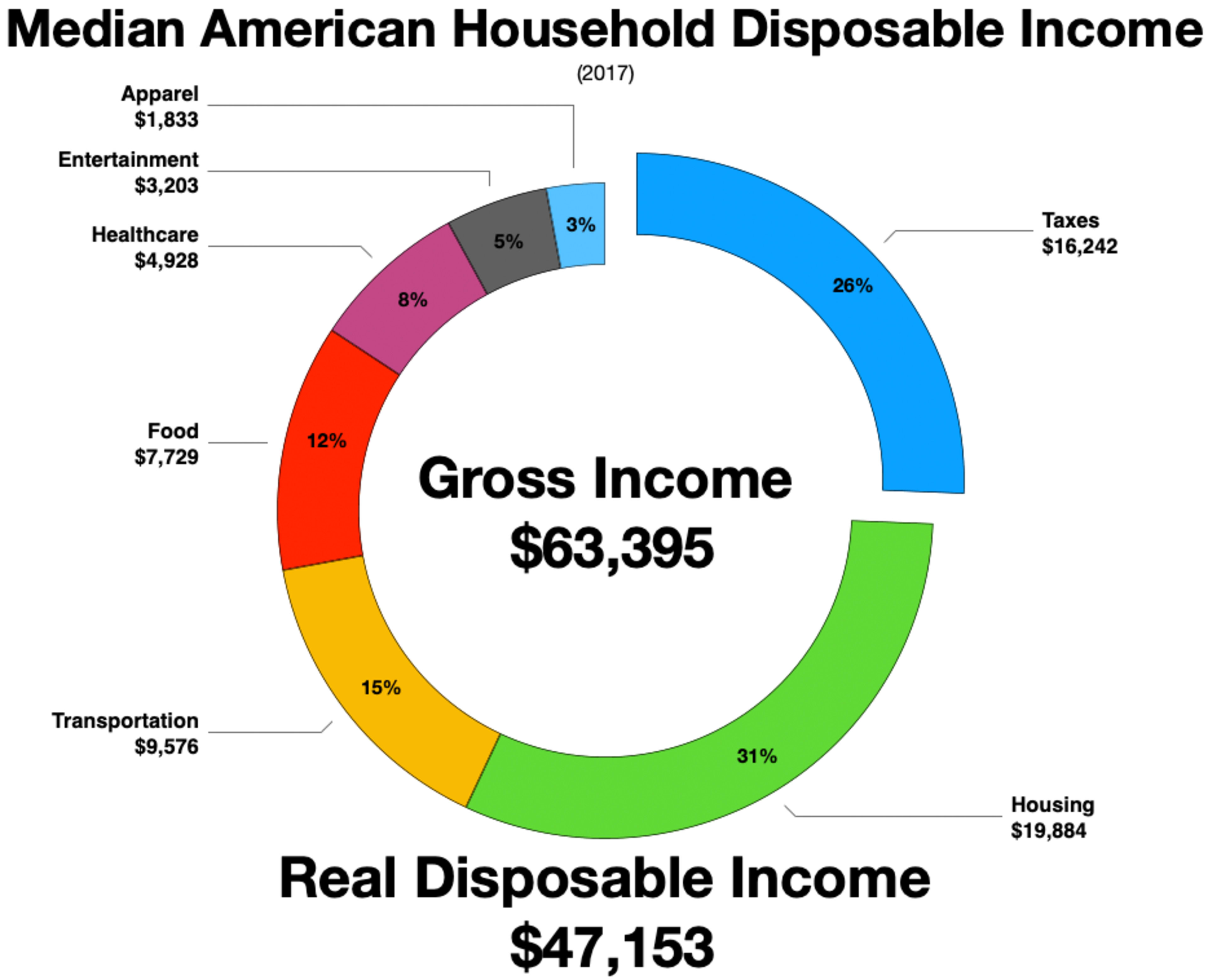
Axis scales and groupings can frame narratives; always inspect baselines and categories.
https://commons.wikimedia.org/wiki/File:Household_spending_United_States.png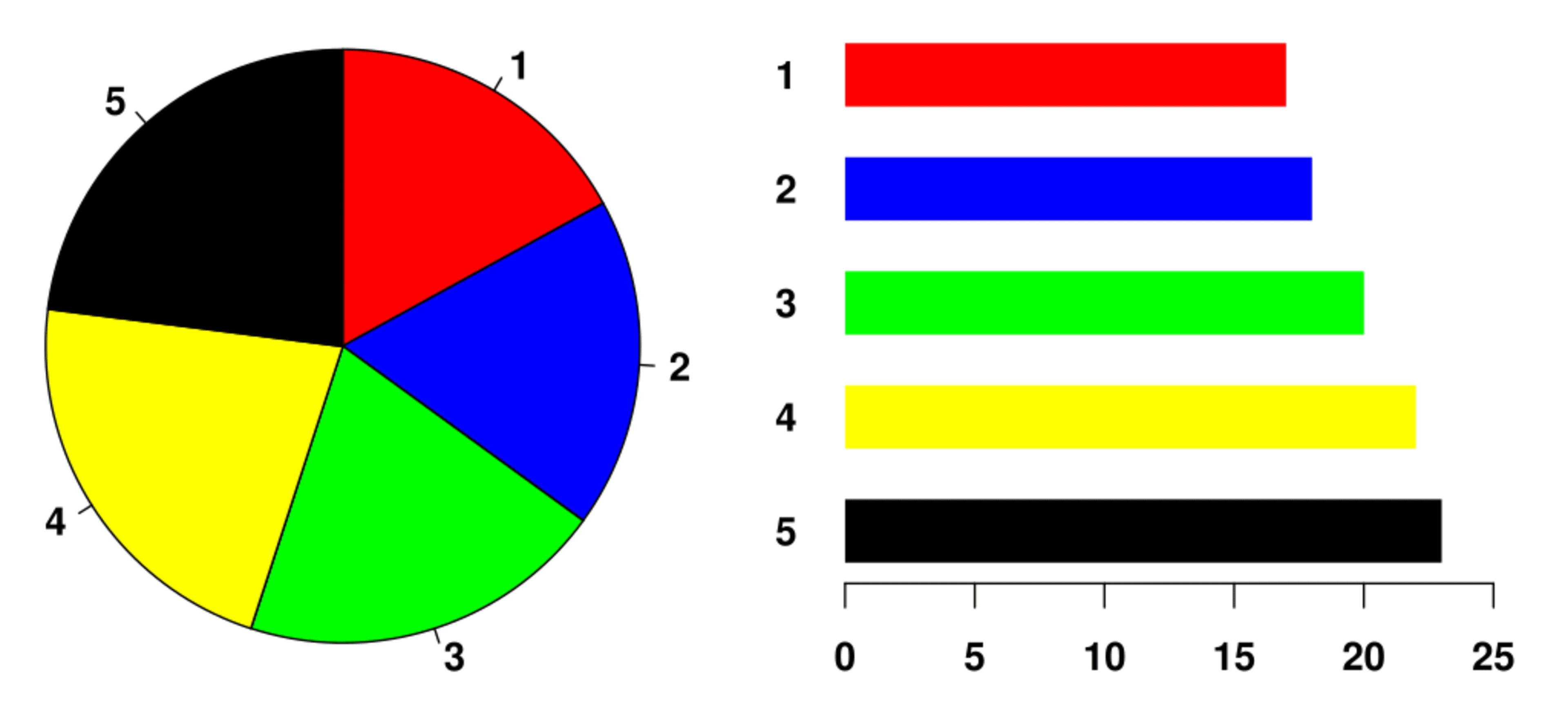
Pie slices are harder to compare than aligned bars; consider bars/treemaps for composition.
https://commons.wikimedia.org/wiki/File:Piechart.svg
Flip the Y direction so larger values are drawn lower; readers may misread the trend.
https://www.livescience.com/45083-misleading-gun-death-chart.htmlPopular Techniques
Click a card to prefill the builder.
Use unnecessary charts to make it more complex
Use biased labels
Add trend lines to irrelevant data to make it look like there is a trend
Compare different sizes of pie charts or hard to distinguish thin slices
Scale pictograms by area/volume to exaggerate differences.
Use unlabeled logarithmic scale.
Start y-axis above 0 to exaggerate changes.
Adjust y-axis maximum to alter perception.
Remove ticks and axes so data cannot be judged.
Inconsistent tick intervals or units.
Omit data points that do not fit the narrative.
Overly complex chart hides key information.
Incorrect proportions, labels, etc.
Use unreasonable data to extrapolate the future.
See also: the reference list on our About page for sources and real examples.